Warm Colours and Curves: Materials and Comfort in Compact Spaces
Looking at Brazil's Casa Magma exhibition, we weigh the light, space, and upkeep trade-offs of warm-toned curves and textured tile in small Hong Kong flats.
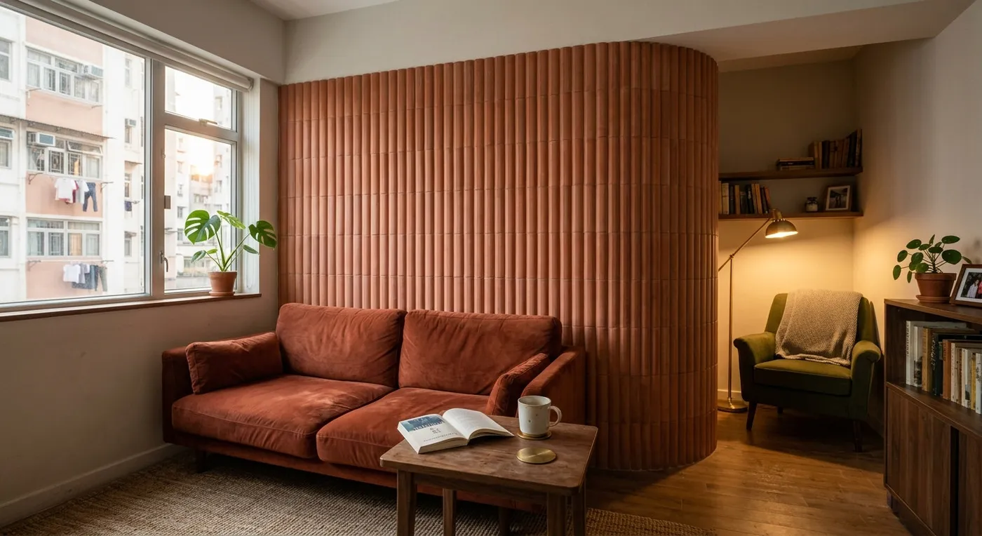
We recently came across Casa Magma, a showcase by Brazilian studio Suite Arquitetos at Casacor São Paulo. Using deep reds, terracotta, and walnut alongside curved walls and a sunken living room, the design creates a distinct sense of being cocooned. The concept translates surprisingly well to small Hong Kong flats (we are constantly hunting for a sense of security within limited square footage), but copying a show installation wholesale runs straight into a wall of practical problems. Here, we take an objective look at the pros and cons of warm-toned curves from the angle of materials and spatial psychology.
Warm Tones: More Than Just Visual Warmth
Earthy tones like deep red, burgundy, and terracotta read as warm and relaxing, and psychologically they create a sense of being enclosed and secure. But many Hong Kong flats already lack natural light, and painting an entire room in a dark shade only makes the space feel darker and more oppressive. We would suggest applying these colours selectively (a headboard wall, the wall behind the TV) or introducing them through furniture and soft furnishings like a sofa or curtains, so the space still reads as open.
Curved Walls: Taking the Edge Off
At the entrance to Casa Magma, a curved wall of fluted tiles guides the flow of movement. That curve softens the hard edges a straight wall creates, and it works especially well at the end of a corridor or in an entryway. The catch is that a curved wall eats into usable floor area: in a 200-square-foot flat, forcing one in is often a waste of space. A more realistic move is a curved doorway or a rounded cabinet edge, which gets you a similar softening effect without giving up as much room.
Material Texture: From Sight to Touch
Suite Arquitetos relied heavily on fluted tiles, whose ridged surface catches and breaks up light to add depth. But Hong Kong’s humidity makes grooved tiles like these harder to keep clean in a kitchen or bathroom, since dirt and grime collect in the grooves. If you want a similar effect without the upkeep, smooth tiles with a matte finish, or textured wallpaper and decorative paint, get you close visually while staying much easier to maintain.
Warm-toned curves are a strong design language overall, but they need to be adapted to local conditions. If you are weighing a similar design dilemma, we would be glad to talk it through with you.
Discuss your space
Share your floor plan or photographs for a considered assessment of design possibilities, practical constraints and budget.